One of the biggest challenges homeowners face is choosing paint colors that feel intentional, balanced, and harmonious from room to room. You might love several styles, several tones, and several Pinterest boards… but how do you bring them all together in one home without feeling chaotic or mismatched?
That’s where color flow comes in.
Color flow is the art of creating visual continuity. It helps your home feel connected, calm, and thoughtfully designed—even if each room still has its own personality. And when done well, it can elevate your entire space, making your home feel polished and custom-built from the inside out.
If you’re trying to figure out how to choose home colors, here’s how to create a cohesive interior color flow throughout your home.
1. Start With a Whole-Home Color Palette
Think of your home the way designers do: as one connected environment rather than isolated rooms. The easiest way to achieve flow is by choosing a whole-home color palette before you start selecting paint, flooring, or finishes.
Here are some ideas for a color scheme for your entire home:
- One main neutral (e.g., soft greige, warm white, muted taupe)
- One secondary neutral (slightly darker or cooler than the main tone)
- Two to three accent colors (deep green, soft blue, muted clay, or whatever suits your style)
- Wood tones or metals (your “finish palette” should also stay consistent)
This palette becomes your design North Star. Each room may use different proportions of these colors, but everything still ties back to the same coordinating colors in the home.
Pro Tip: Start with the largest, most open areas of your home, like the living room or kitchen. Let that palette guide less visible spaces like bedrooms or offices.
2. Choose One Dominant Wall Color for Most Shared Spaces
If your floor plan is open, a single wall color helps everything feel seamless. Soft whites, warm grays, or light greige tones work especially well because they pair easily with wood textures, stone fireplaces, and popular finishes like black, bronze, or brushed brass.
This one choice alone can dramatically improve flow:
- Your trim, doors, and ceilings stay consistent
- Transitions between rooms feel natural
- Your furniture and décor don’t compete with bold wall changes
If you want deeper or more saturated colors, use them intentionally as accent walls or in enclosed rooms rather than switching colors randomly.
3. Let Each Room Borrow From the Same Palette
You don’t need every room to match. Instead, you want each room to feel related.
Here are some home color palette ideas:
- If your main living area uses a soft greige wall color with navy accents, your dining room might use navy as a wall color, but keep greige in the furnishings or trim.
- If your kitchen has warm woods and black hardware, bring black into your bathroom light fixtures or mirror frames.
- If your entry has dusty green décor, use the same tone in a guest room throw blanket or artwork.
The rooms feel varied and interesting but visually cohesive.
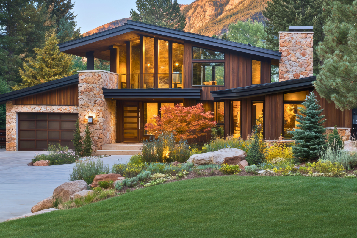
4. Repeat Materials, Finishes & Textures
Creating cohesive color flow isn’t just about paint. A huge part of harmony comes from repeating materials, finishes, and textures throughout your home so each space feels connected.
Start with your fixed finishes, which are the architectural elements that set the tone:
- Flooring
- Cabinet stains
- Countertops
- Tile
- Hardware
- Light fixture metals
Repeating these helps rooms feel related, especially in open-concept layouts where everything is visible at once.
Then layer in consistent textures to add warmth and balance:
- Similar wood grains
- Woven or natural-fiber elements
- Repeated stone or tile patterns
- Complementary textiles and fabrics
When finishes and textures echo each other from room to room, your interior color flow feels effortless, even if each space still has its own personality.
Pro Tip: Stick to just a few wood tones and metal finishes to keep your home visually unified.
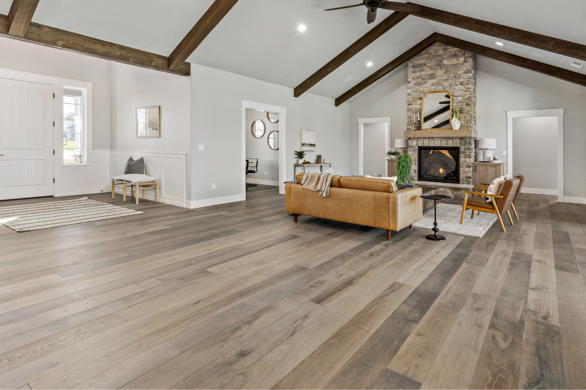
5. Use Flooring to Anchor Your Palette
Your flooring, especially the main level flooring, acts like the “backbone” of your color flow. Because it touches nearly every space, its tone influences everything else:
- Paint color undertones
- Cabinet stains
- Furniture shades
- Pops of color
Choose your flooring early and let it help guide your palette. Warm floors typically pair best with warm neutrals; cooler floors prefer cooler color choices.
If you choose multiple flooring materials (LVP, carpet, tile), select tones that complement one another instead of making large jumps in color temperature. This will help you maintain a cohesive color scheme and feel throughout the home.
6. Pay Attention to Sight Lines
Stand in your main living area and look around. Wherever you can see multiple rooms at once, the colors should relate intentionally.
For example:
- If you paint your office a bold dark green, make sure the color visible from the hallway doesn’t clash with your living room décor.
- If your pantry or mudroom is visible from the kitchen, keep those rooms neutral colored or use accents that echo the kitchen palette.
- If you have a loft or open stair railing, consider how the upstairs hallway color interacts with the main level.
Indoor color flow is just as much about how spaces connect visually as how they feel individually.
7. Use Accent Colors Sparingly & Consistently
Accent colors are where personality comes in. But the key is intentional repetition.
Pick 2 or 3 accent colors and sprinkle them throughout your home in different ways:
- Pillows
- Artwork
- Rugs
- Cabinet hardware
- Backsplash tile
- Décor pieces
- Bedding or textiles
These colors should tie into your whole-home palette and help connect spaces without overwhelming them.
If you love a bold color but want it toned down throughout the house, use different shades of the same hue:
- Sage → Olive
- Navy → Dusty blue
- Terracotta → Soft clay
This keeps things visually cohesive and the same color family while still allowing variety.
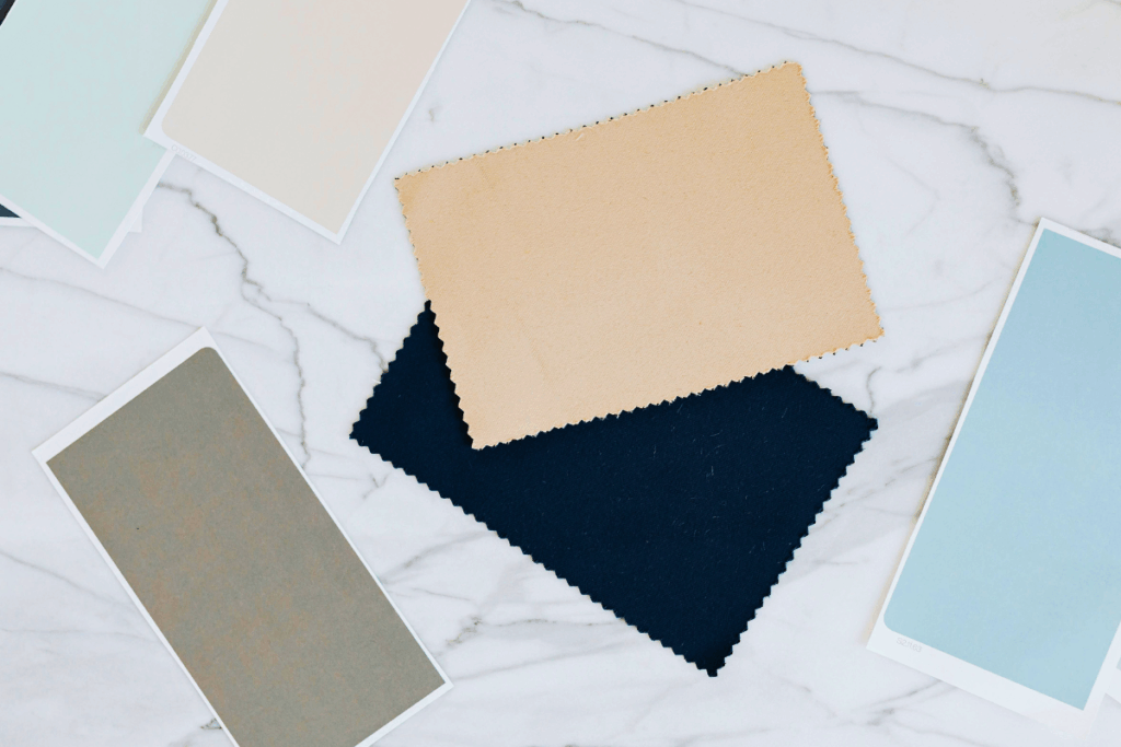
8. Pay Attention to Undertones
One of the biggest reasons color flow breaks down is mismatched undertones. Undertones are the subtle warm or cool hues beneath a color, and they influence how well your palette works together, even when colors look similar on a swatch.
Common undertones include:
- Warm neutrals: yellow, peach, or pink undertones
- Cool neutrals: blue, green, or violet undertones
- Wood tones: red, orange, or ashy gray undertones
- Stone and tile: green-gray or brown-gray undertones
When undertones don’t align, rooms feel disjointed.
Here’s how to use undertones to strengthen your whole home color palette:
- Make sure your main neutral and your flooring share a similar undertone.
- Keep your cabinetry stain within the same warm or cool family.
- Compare swatches next to your fixed finishes (never in isolation).
- Choose accent colors that complement the undertones of your anchor materials.
Mastering undertones is one of the most important parts of building a smooth color palette and a cohesive color scheme for the entire home.
Pro Tip: Evaluate swatches in different lighting. Idaho’s shifting natural light makes undertones especially noticeable.
9. Create Flow With Lighting
Lighting affects how color appears, so consistency in your lighting temperature (Kelvin rating) is essential.
For a cohesive home:
- Keep all fixtures between 2700K and 3000K
- Avoid mixing warm white and cool white bulbs
- Use dimmers to soften transitions between rooms
Lighting unifies your color palette more than most people realize.
Final Thoughts
A cohesive color flow doesn’t mean every room has to look the same. Instead, it’s about building visual harmony that makes your home feel intentional, inviting, and beautifully connected.
By choosing a whole-home palette, repeating finishes, coordinating accents, and designing with sight lines in mind, you can create a custom home that feels thoughtfully curated from the moment you walk in the door.
If you need help designing a color flow in your home, our interior design experts are here to help. Let us help you see what’s possible.